This post is part of a series of posts on Adjusting Exposures. The series begins here.
When images in this post have nearly identical, top and bottom halves, top halves show effects of adjustments and bottom halves show the original image.
Curves Adjustments in Photoshop
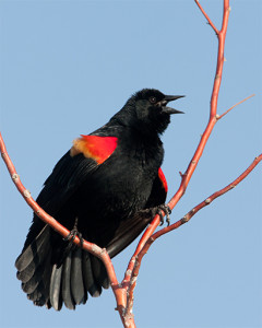
This time I’m going to start with an actual photograph instead of a graphic image. The photo of a male Red-winged Blackbird that we adjusted with Levels in Part 2 of this series gave me the idea for this talk. The photo is displayed again in Figure 1.
Recall that I wanted to process the photo to bring out detail in the dark tones. When I tried doing this with Shadows/Highlights, I found myself fiddling around with Shadows/Highlights parameters more than I wanted to. Bringing out dark tones wasn’t difficult, but doing so without creating a noticeable halo was or changing the color of the sky was. It seemed like it might be easier to use Curves.
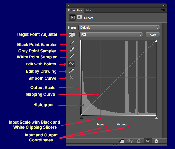
Figure 2 shows the adjustment menu for Curves. The Mapping Curve (my terminology) tells how the Curves filter will map input tones on the horizontal axis to output tones on the vertical axis. Both axes have scales that run from 0 (black) to 255 (white). The straight line Default Mapping Curve in Figure 2 indicates no changes will be made: Blacks will be mapped to blacks; whites will be mapped to whites; grays will be mapped to equivalent grays. Several other standard mapping curves can be selected from the Preset menu at the top of the adjustment menu.
Other items on the adjustment menu access tools designed to help define custom Mapping Curves. There several way to do this:
- Click the Auto button and let Photoshop find a Mapping Curve for you. Photoshop is a pretty smart program, but I think I have a better sense of how I’d like my photos to look than it does. However, sometimes the automatic mapping is a good place to start.
- When the Edit with Points button is clicked as it is in Figure 2, click on the Mapping Curve to define a point and then drag the point to change the shape of the curve. To remove a point from the Mapping Curve simply drag it off the graph.
- Click the Edit by Drawing button and then draw a Mapping Curve with the mouse. Clicking the Smooth Curve button will smooth the curve.
- Move the Black and White Clipping Sliders to make Levels-like adjustments. Holding down the Option key on the Mac or Alt key on Windows while moving the Black and White Sliders displays colors that will be clipped (i.e., dark colors that can’t be made any darker because one of the Red Green or Blue values is 0 or light colors that can’t be made any lighter because one of the Red, Green or Blue values is 255).
- Click the Target Point Adjuster button and click on a target location in the image to select a tone on the Mapping Curve. While still clicked on the image, drag up and down to change the output tone for that point.
Sometimes it’s useful to know what input and output coordinates correspond to a point of the graph. Mousing over the graph causes input and output coordinates for the mouse pointer to be displayed in the Input and Output field beneath the graph.
Like Levels, Curves can be used to adjust colors. However, as I did in the Levels discussion I’m just going to point out that in addition to having an RGB adjustment for mapping gray tones, Curves has Red, Green, and Blue scales for mapping color values. Color Mapping Curves can be defined similarly to the way the RGB Mapping Curve is defined. It’s also possible to use the Black Point, Gray Point, and White Point Samplers to select colors in the image that are to be mapped to black, 50% gray, and white.
Its mildly entertaining to see what happens to your image as you change the Mapping Curve. To start over with a fresh Mapping Curve select Default or some other mapping option from the Preset menu.
Remember that I started this discussion by saying how easy it is to make Curves adjustments. All those options don’t make it sound easy at all. Here’s all I had to do to adjust the Red-winged Blackbird photo:
- I clicked the Target Point Adjuster button and then clicked on the sky. This put a point corresponding to the sky’s gray tone on the Mapping Curve.
- With the Target Point Adjuster button still depressed, I then clicked on a gray spot on the Blackbird’s breast and dragged the mouse up and down until I liked the effect.
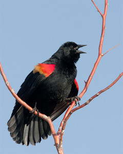
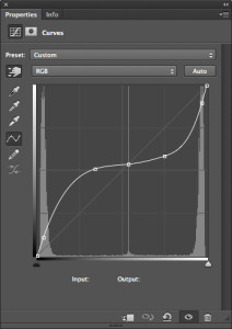
That’s it. The adjusted Red-winged Blackbird photo is in Figure 3. The Curves adjustments are shown on Figure 4.
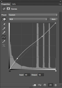
Figure 4. Curves adjustment for the Red-winged Blackbird photo in Figure 3. Two points were added to the Mapping Curve. The point in the lower left is the gray tone value for a gray spot on the bird’s breast. The point at the upper right is a gray tone value for the sky.
Notice that I achieved more detail in dark tones by making the Mapping Curve steeper. Dark grays were then mapped to lighter grays. This is an example of a general rule: Make mapping Curves steeper in tonal regions where you want to bring out more detail.
Let’s try this with the contrived spider graphic used to demonstrate Shadows/Highlights adjustments. The result is shown in Figure 5.
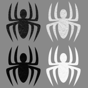
Figure 5. The top half of the image show the results of adjusting the spider graphic with the Curves adjustments shown in Figure 6. The bottom half of the image is unadjusted.
The Mapping Curve for the Curves adjustment is displayed in Figure 6. The middle point assures that the background tone will not be changed. The two points adjacent to it are needed to assure that values of output tones will increase when values of input tones increase.
Curves vs. Levels
Black and White Input Sliders in Curves act just like Black and White Input Sliders in Levels. Once the Black and White input range has been established with the Black and White Input Sliders, ends of black end of the curve can be moved up and the while end of the curve can be moved down to simulate the effect of the Black and White Output Sliders in Levels.
The Gray Slider is the only Levels adjustment that’s missing in Curves. In effect, the Gray Slider adjusts the shape of a curve by setting one parameter. Curves allows you to specify the shape of the curve by placing points on it. In effect, you can set as many parameters as you care to. The additional flexibility of Curves comes at a price. It’s easy to get trapped into spending lots of time adding points and moving them around while trying to achieve a perfect adjustment.
Without falling into the trap of perfectionism, I’m going to conclude this post with the application of Curves to the Jackrabbit photo that I adjusted with Levels. Figures 7 and 8 show that photo and the final Levels adjustment:

Figure 8. Jackrabbit photo with Black, White and Gray Input Levels Sliders set to 10, 205, and 0.95 and Black and White Output Levels Sliders set to 15 and 240.
Figure 9 shows the jackrabbit photo with a Curves adjustment intended to mimic the Levels adjustments for the photo Figure 8.
Figure 10 displays the Curves adjustments used to generate Figure 9. The short horizontal line on the lower left portion of the Mapping Curve causes all tones between 0 and 10 to be mapped to 15. The longer horizontal line at the upper right portion of the mapping curve causes all tones between 205 and 255 to be mapped to 240. The point in the middle of the Mapping Curve was selected to adjust the mapping of tones between 10 and 205.
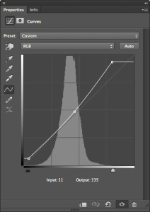
Figure 10. Curves adjustments intended to mimic the Levels adjustments for the Jackrabbit photo in Figure 9.
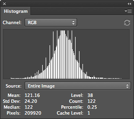
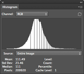
I once thought that Curves adjustments could mimic Levels adjustments exactly. That’s not the case. To see why consider the Histograms in Figures 11 and 12.
There’s clearly something peculiar about the Levels algorithm. Combing occurs when a smaller range of values is mapped to a larger range of values. Spiking occurs when a larger range of values is mapped to a smaller range of values. In this case, the Levels Histogram exhibits both combing and spiking. I image this happens because Levels calculations are done in stages with rounding to integer values at the end of each stage. There’s no way to simulate that kind of effect with the a smooth Curves calculation that only does rounding at the end.
The Curves Histogram is much as you’d expect it to be. The steeper slope of the Mapping Curve for lighter tones causes the combing. For darker tones the Mapping Curve closely matches the Default Mapping Curve. Because they distort the Histogram less, Curves adjustments are preferable to Levels adjustments for situations that call for changes to both the input and the output range combined with gamma adjustments made by moving the Levels Gray Slider.

